How to Achieve Contrast in Your Pattern Designs
Having a pattern design with poor contrast can result in your design not looking as amazing as it can. Can you relate to this…You’ve tried countless times changing and tweaking things but to no avail. You’ve tried swapping the colours around many times, yet it still looks ‘blah’. I hear you! I’ve been there many times too and it’s no fun :( I still have days like that now and it can be overwhelmingly frustrating to say the least!
You know that:
the colours work well together as a group
you’ve designed your motifs beautifully
you’ve include a good variety of scales/sizes
your motifs have great variety and line work
your layout looks good
so… why isn’t it looking good?!
The truth is that there are a lot of pieces that go into a pattern design to make it look good. Just like a jigsaw puzzle, all the pieces must fit together in the right way, otherwise it’ll give us poor results.
After many failed attempts at colour palettes, I now use a super simple strategy to alleviate that headache and I want to teach you how to do it too. Read on to find out more…
Using the Tonal Range Chart
This seemingly simple thing can save you a TON of time and frustration. You may have seen this before but if you haven’t, let me explain how it works.
It is a series of coloured shapes (in my case squares, but they can be any shape)
It starts on level 1 -white and goes up to level 9-black
Each level is slightly darker than the last
Our aim is to have at least a difference of 4 between our lightest and darkest colour
The purpose of the tonal range chart is to:
place each colour we’re using/wanting to use on the corresponding level to which it matches most closely (it doesn’t have to super accurate)
to see straight away if we have too many colours in one area or on a particular level
evaluate the tonal ‘difference’ between our colours
know where we need to focus our efforts to improve
In the pattern design below:
it looks foggy / washed out / pale
the motifs aren’t standing out from the background
the orange and peach colours blend together
the overall contrast isn’t high enough
Important points to notice:
the pattern design layout is good
the pattern motifs are drawn nicely
the overall colour palette is ok (although as we’ll see in a moment requires some tweaking)
the design has a variety of scales/sizes
have some variety in line work
What we don’t yet have is good contrast. Why not I hear you asking?! Well, when it comes to contrast it’s not always straight forward sadly. In most cases it’s usually because the the tonal ranges are too close together, that is, they are too similar.
To understand why this pattern doesn’t have effective contrast, we need to look at a few things first:
what colour do we have as the background?
are we using our darker colours effectively?
do we use plenty of lighter colours to increase our tonal range?
are we using a range of colours throughout the design?
are there any colours where we’re using too much or too little?
Step 1 - Analyse the colour palette
Look at the colour palette used on the pattern design.
We need to be a colour detective and see if we can spot where any changes are needed.
Ask yourself:
do you have some lighter colours? (tints)
do you have some medium colours? (tones)
do you have some darker colours? (shades)
do you have some neutral colours? (think white, cream, beige, brown, grey, tan etc)
do you have some muted/or soft colours?
do you have a POP colour? ( 1-2 colours that stand out from the others and attract your attention)
After you’ve looked at your colour palette and answered the above questions, you’ll be in a better position to know where you need to concentrate your efforts and do some tweaking.
Step 2 - Changing to greyscale
Turn the colour palette to greyscale. Be sure to copy the colour palette FIRST so you have a duplicate and can see exactly which colours show as light, medium and darker.
Below is the colour palette and in grayscale. Notice that:
the blue and purple on the far right are the darkest colours
the pink is the next darkest colour
the background colour is the 2nd colour on the left
the colour palette as a whole has GOOD contrast despite the pattern design looking a big foggy/pale/washed out (stay with me here as I’ll explain…)
Step 3- Using the tonal range chart
Put the greyscale colours onto the tonal range chart above the corresponding level to which they match. They will not match perfectly here and you may have some colours that are too dark for one level, yet too light for the next. Just select the closest level for the colour. Once you’re done this, you’ll have a much better idea of where your colours are and if you need to make any changes.
The colour palette as a whole has GOOD contrast, yet the pattern design isn’t working currently contrast wise. Why not?
Well, the 3 darkest colours are:
the blue - level 5
the purple - level 6
pink - level 4
The background colour is on level 2, so although we have a LOT of the pink in the design, the difference is ONLY 2, meaning there isn’t enough contrast between these two colours. Furthermore, the blue and purple (the darkest colours) are only used in small amounts, so only have a very small effect on the overall contrast.
Step 4 - Fixing the contrast
To fix this design (assuming we want to keep the colours where they are) we need to:
change the saturation and make the colours brighter
lighten the colours
or make the colours darker/richer
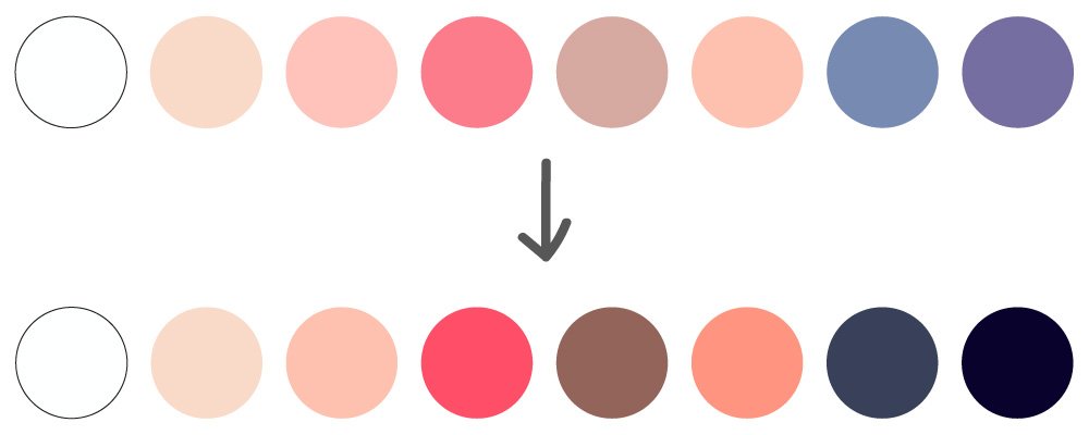
One of the first things to notice about the ‘new’ colours chosen, is that they look cleaner, that is, they don’t look foggy or washed out anymore. They appear more pure and fresh. They only needed a bit of refining to get them looking good too.
Step 5 - Re-test on the tonal range chart
Having now changed the colours and made them more saturated or darker, it gives more contrast to the colour palette. Let’s re-test the colours on the tonal range chart to check.
We have much higher contrast now with the dark blue being on level 9! You certainly don’t need such high contrast as this pattern design, but the colours now span the entire tonal range from level 1 to 9, meaning the colour palette as a whole is much more balanced.
What has changed:
The pink is now on level 5, whereas before it was level 4 giving more contrast against the background colour
the background colour has NOT changed but looks clearer when compared to the first pattern which looks foggy
the brighter orange contrasts better with the background and pink colour
the brown has been made darker and richer and gives more contrast
the colours work better together as a group while still maintaining the overall feel/mood as before
the smaller white flowers stand out better too
Step 6 - Apply the new colour palette to the pattern
The finished colour palette on the pattern design looks much better than it did, and we only had to make a few changes to the colours. Sometimes when your contrast is off, you may need only a few tweaks to get it just right, so don’t abandon it too soon! Stick with it as it may only be a couple of levels off or need a tiny change to the saturation/lightness or darkness to get it looking really good.
I hope you’ve enjoyed this contrast tutorial and it will help you if you get stuck with contrast and how to test your colours.
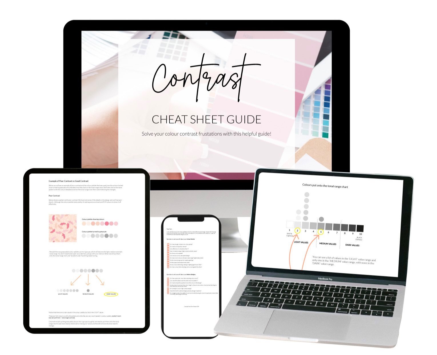
Grab my FREE contrast pdf guide below which guides you through step-by-step exactly how to test your tonal ranges in much more depth than I can do here.


Do you want to know the essential colours you need in your Christmas pattern designs? This post will show you some example of what they are plus show you how using the right motifs tie everything together.