How to Create a Calm & Tranquil Mood in Your Pattern Designs
You can create different moods on a pattern just by changing the colours. In today’s blog post, I’m showing you how changing the colours can alter the perceived mood of a design because of colour psychology and how our brains interpret the information to convey to different emotions and feelings.
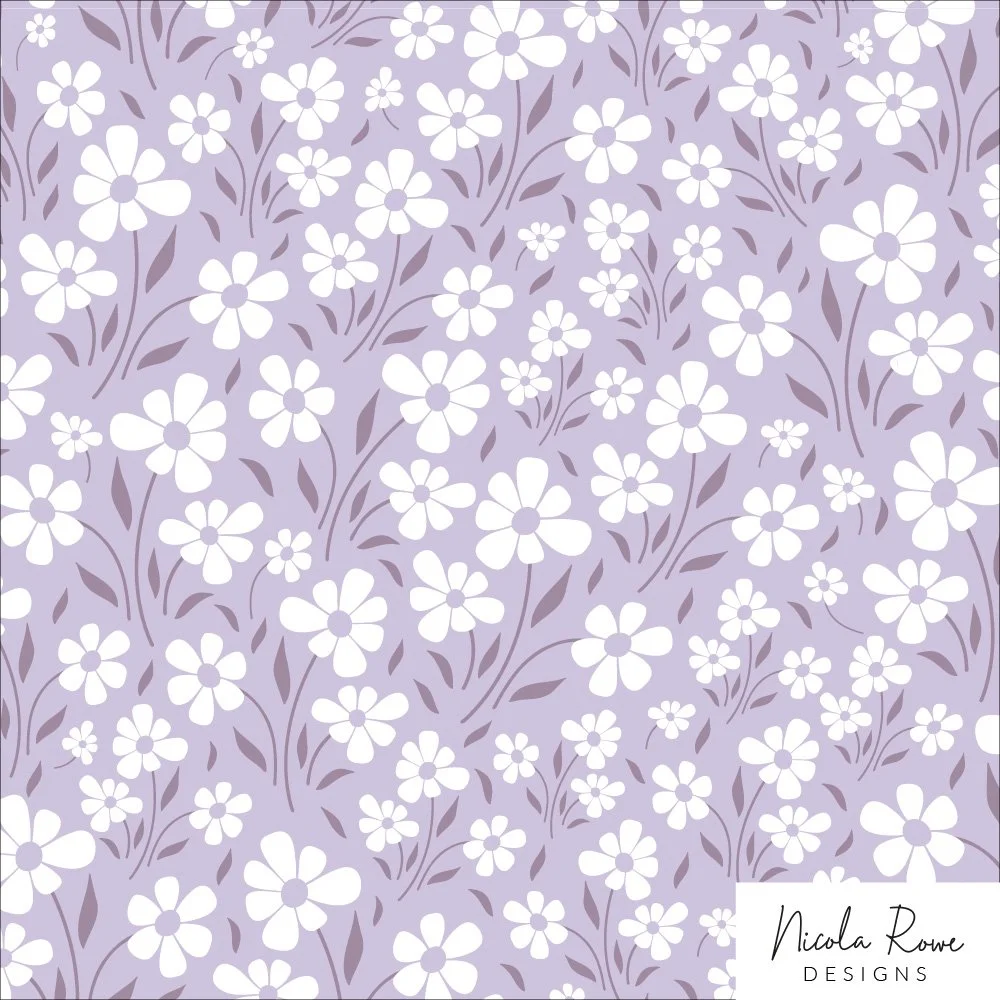
The pattern above evokes a sense of calmness and tranquility because of the colours used, but why? First we need to understand what the colours mean in colour psychology…
A rough guideline of the colours and their meanings in colour psychology:
Red - energy, passion, love, excitement, danger, confidence
Orange - friendliness, happiness, adventure, energy, enthusiasm, sociability, warmth, fun
Yellow - positive, warmth, uplifting, youthfulness, playfulness,
Green - nature, calming, growth, harmony, renewal, health, vitality,
Blue - calming, relaxation, trustworthy, security, optimism, soothing
Purple - dreamy, magical, royalty, luxurious, spirituality
Brown - earth, stability, reliability, groundedness, mature, formal, security, protection, outdoors
Black - mourning, power, authority, mystery, intrigue, formal, elegance, loneliness
White - purity, innocence, peace, calm, perfection, spirituality, simplicity
Grey - balance, formal, calmness, maturity, sadness, maturity, neutrality
With this knowledge in mind, you can see the original pattern below that I started with and the colour palette I used. A simple floral pattern in red, white and dark muted blue and then below this, how I’ve changed the pattern colours to represent a calm & tranquility mood.
Changing to Colours to Evoke the Mood & Feeling of Calm & Tranquility
In the example below, I’ve changed the colours to white and green. The pattern has a lot of white so straightaway looks more peaceful and calm when compared to the red example above. Together with the muted light green background this adds to the feeling of it being calm, relaxing, peaceful and easy to look at. The leaves and foliage I made a darker muted green just to give some much needed contrast between the two lighter colours.
In the pink example below, it too feels calming, relaxing and peaceful. This is because of the pale pink background and white. Together they are soft colours so give the feeling and mood of softness, calm, tranquility and gentleness. The muted dark grey is a neutral colour and just there to add some contrast. Plus white, pale pink and grey is a great combination and so works together really well.
In the purple example below, it also creates a tranquil and calm feel but also because it has purple, we know that this colour evokes feelings and the mood of mystery, dreaminess and magic. If you want to create a pattern that has a dreamy feel to it, include purple! Though pink works equally well too.
If you need help with your colour palettes and want to get started straightaway with creating, check out these websites:
I hope this blog post has helped you understand how a few simple changes to colour, can evoke a different mood and you don’t need a complicated pattern to do so. Use the information I shared at the top of the blog post to help when you’re next creating colour palettes so you can evoke the mood & feeling you’re aiming for.
If you’re new to pattern design or wish to simply get more information about colour psychology and how to create specific moods with your colour choices, check out my FREE Colour Palettes masterclass happening next in January 2025. You can get on the waiting list below.
If you’d like to sign up to the monthly newsletter, where I share free goodies including colour palettes and a pdf/worksheet/cheat sheet each month to help you in your creative career, sign up below.


Do you ever get frustrated and stuck on getting the right tonal values in your pattern designs? This tutorial will show you a simple yet powerful exercise to elevate your designs quickly.